-
The Essential Elements of an Eye-Catching Sign
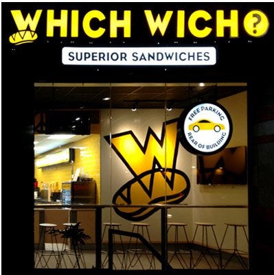
A quality sign should capture the attention of its intended audience and send a clear message. When you are creating a sign design for your business, you will achieve the best results when you work with a sign company that specializes in custom made signs serving Chandler and Phoenix . Professionally designed outdoor signs and building signs will contain key design elements that make them easy to see and understand. To help you get started on your sign project, let’s take a look at some of the most important elements of sign design.

Bold Colors
When you are designing a new sign for your business or retail space, you may want to start by thinking of a color scheme. The colors on your sign should be bold and clearly visible from a distance. Pairing light colors, such as yellow and white, may cause your sign’s text or logo to fade into the background. Strong colors, such as black, blue, and red, are all perfectly suited for a sign design.
Easy to Read Text
An eye-catching sign will also include text that is easy to read. As you are creating your sign, you may want to ask about the ideal size for your lettering. To advertise your business, it is important to make sure that your potential customers can read your sign from far away. Any text that is chosen for your sign should be printed in a typeface that is clearly legible and suited for use on signage.
Brand Identity
Commercial or retail signs can also be used to send powerful message. You will want to make sure that your sign matches with the identity of your brand. By including your business logo or other unique features, you will be able to create a sign that is visually striking. A sign design company that serves your local area will help you create new signage that is clear, beautiful, and in sync with the personality of your company.
-
Exploring the Benefits of Using Channel Letters
We Build Signage for Chandler & Phoenix, AZ Businesses
The signage at your business is important to the curb appeal and overall appearance of your location. You want the signage to be eye-catching and professional to give visitors a good first impression. If you’re creating new signage for your Chandler or Phoenix, AZ business, you may want to consider the use of channel letters, and the team at 1 Stop Signs is here to tell you why. These letters are used to create three-dimensional LED signs that are highly visible and easy to read from a distance. This gets your business more attention, drawing people to your location. Our team is here to tell you more about the use of channel letters and their many benefits. Continue reading to learn more or reach out to us with any questions.

What is a Channel Letter?
Channel letters are a type of letter used to create signage for businesses. They are different from other types of signs in that each letter is separate from all the others. The 3-D letters are placed individually next to each other on a building to spell the name of the business. Due to their three-dimensional design, the letters protrude from the mounting surface, creating an eye-catching depth that other signage doesn’t produce. These letters are commonly used at shopping malls, retailers, restaurants, bars, medical buildings, and more.
Channel Letters Have Many Advantages
Channel letters are an excellent choice for businesses looking to make a statement with their signage. Their bold and bright designs are sure to catch the eyes of passersby and help draw them in. Many businesses choose to use channel letters not only for their attention-grabbing appearance but also because of the extensive customization options. No matter the current branding of your business, channel letters allow you to create signage that matches your aesthetic. Continue reading to learn all about the biggest advantages channel letters provide.
Flexible Design Options
When it comes to the design of your channel letters, the possibilities are practically endless. You can create anything you want with the flexible design options that channel letters provide. You’ll be able to choose the size, shape, color, and style of your letters to ensure they match the rest of your branding.
Various Styles of Illumination
Though you can choose to have channel letters that do not illuminate at night time, we recommend lighted letters for those businesses who want 24-hour visibility. You’ll have a few different options on how to light your letters, including:
- Front-Lit: This is the standard design for channel letters that is made with an acrylic front surface that is either clear or colored and an aluminum backing. The bulbs sit under the acrylic front to illuminate the letters from inside, shining outward through the acrylic front.
- Reverse-Lit: This type of lighting is also known as halo-lit or back-lit and is the exact opposite of front-lit illumination. The front face of the letters is aluminum while the back is made of clear acrylic to allow the light to shine out from behind the letters. This creates a soft glow around and between each letter.
- Open-Face: This style of letter has no front, leaving any bulbs or neon tubing inside the letters exposed. These letters can create a retro feel but are not always allowed by lighting laws in certain regions.
Indoor & Outdoor Use
Channel letters are incredibly versatile and can be used to create a variety of signage throughout your business space. Because you can choose the size, shape, and lighting options of your channel letters, they make excellent signage for both indoor and outdoor environments. You can also use them to create eye-catching directional signs, which allows you to match all your other signs, helping you to maintain a cohesive look throughout all your signage. 1 Stop Signs specializes in interior and exterior business signs.
Brand Recognition
As a business owner, you must create a consistent image across all channels, from your storefront to your advertisements to your online presence. With proper branding, customers will be able to recognize your business across all channels, and your business will also have a more professional look. Channel letters ensure you can create cohesive branding due to the many customization options. You can match the font and colors with your logo to create a polished, professional look.
High Visibility
You want your business to stand out from the rest, and the best way to do so is with eye-catching signage. Channel letters are highly visible, especially when illuminated, and when paired with a sophisticated logo, they’re sure to grab the attention of anyone passing by. Investing in channel letter signage is an effective and efficient marketing strategy that will get you noticed.
Environmentally-Friendly
Channel letters are a great way to make your business more environmentally-friendly. For starters, they are incredibly durable, which means you won’t waste materials by having to replace them often. These letters will last for many years to come. Secondly, when the letters are illuminated with LED bulbs, you save energy, as LED lights are incredibly efficient. Most LED bulbs will last five years or longer. 1 Stop Signs can help you create eye-catching LED signs for your Chandler or Phoenix-area business.
Contact Us to Learn More about Channel Letters
If you’re ready to design new signage for your business, you want to be sure you do the necessary research. 1 Stop Signs is here to answer all your questions and give you more information about signage options, including channel letters. Please reach out to us today to learn more about this stunning style of signage.
-
Your Guide to Choosing the Best Colors for Your Exterior Business Sign
Choosing colors for your outdoor sign in Chandler and Phoenix can seem daunting, especially considering how important colors can be for drawing in customers. Your signage should feature the colors of your business’ industry while also representing your individual business. Your business’ sign design and colors need to attract and showcase your business to entice customers to enter your store. Continue reading for a brief guide on how to choose colors for your outdoor signs.

Think about your entire sign.
Though your colors are extremely important to subconsciously affecting your clientele, you must consider how those colors will interact with your entire sign design. If you have a specific mascot that features on your exterior signs, then the colors must complement or interact with this feature in a positive and understandable way. It is also necessary to ensure the colors are legible through the font that you have chosen, or that the predetermined colored writing will stand out nicely over your background color.
Choose colors for your business.
Colors have been proven to affect the way customers react to various types of business. For example, red and orange can stimulate appetite, making these ideal colors for restaurants. Greens and browns are seen as natural, healthy colors, so they are often associated with grocery stores and whole foods stores. Choose your exterior sign’s colors based on the colors commonly associated with your business’ industry. These colors will draw in more customers to your store and encourage them to purchase from you.
Consider contrasting colors for impact.
Contrasting colors, such as blue and orange or green and purple, can have a significant impact on your exterior signage. These types of colors create a dynamic and interesting looking sign that will invoke customers’ curiosity. Refrain from using overpowering colors or a vastly uneven use of colors on your storefront signs. By using overpowering or intense colors, you risk customers misunderstanding or disliking your sign’s message. Look for a healthy mixture of all the colors you choose.
-
Top Reasons to Have Good Interior Signage for Your Business
Outdoor signs and storefront signs help your business appeal to new and curious customers, while interior signage plays a different but no less essential role. Interior building signs near Chandler and Phoenix help workers, customers, and business partners easily navigate your interior spaces while simultaneously reinforcing your brand. When designing your interior business signs and incorporating this type of signage into your building layout, keeping a few tips in mind will ensure your interior signs are both appealing and effective.

Brand Reinforcement
Your brand is at the core of your business, and it is what sets your company apart from the competition. Once clients or customers walk through your doors, interior signage can help to reinforce your brand and engender further customer appeal and loyalty. Subtly reminding consumers about the values and traits that your brand represents will help them to associate your business with the positive services and experiences they receive.
Clear Direction
Indoor signage often directs visitors or customers as they move through your building. Thus, this signage should be clear, attention-catching, and appealing to ensure visitors have a positive experience when seeking services. If your interior signage is poorly-developed or designed, visitors will feel confused and dissatisfied; by contrast, clear signage empowers visitors so they will feel confident when navigating your business.
Aesthetic Appeal
Signage is both a functional and decorative element of any business interior, and the right—or wrong—signage can have a significant impact on the appeal and atmosphere of an interior space. Good interior business signs will remain visible while complementing the style and décor of your business. This makes your space look more professional and helps customers feel more comfortable and confident while inside. Poor signage that clashes with your décor leaves customers feeling as though you weren’t concerned with the aesthetic appeal of your business, and often has a negative impact on their impression of your brand and their likelihood to return in the future.
-
Answering Common Questions About Exterior Illuminated Signs
Illumination can give your signage the boost it needs to capture attention from a greater distance, as well as maintain the visibility of your storefront signs after dark. Custom LED signs will help your business stand out against the competition, presenting a more modern and appealing storefront that will draw customers through your doors. If you’re considering the many benefits of illuminated signs for your business in Chandler and Phoenix, you may also have a few questions about these signs—keep reading for the answers to a few common questions about the exterior illuminated signs you can choose for your business.
Custom printed signboard in Phoenix, sign shop
What are LED signs?
LED signs incorporate the latest technology into lighted storefront signs. These signs use LEDs, or light-emitting diodes, rather than traditional fluorescent bulbs or neon tubes to provide light. LEDs offer several amazing benefits when incorporated into exterior signs, including even backlighting, low energy consumption, and long lifetimes to prevent partial or complete loss of illumination, which can make your storefront look poorly maintained.
How many colors should I use in my sign?
Illuminated signs can incorporate as many colors as you’d like, depending on the technology present in the signage. Many businesses prefer a sign that reflects their logo, including the type and number of colors in the logo. While monochrome signs can be more cost-effective, many businesses find that multi-color signage is well worth the investment, bringing in added business quickly and reliably. If you aren’t sure how your choice of color will affect the final cost or maintenance requirements of your storefront signs, we can help you evaluate your options to determine the best solution for your needs.
How do I make my sign noticeable during the day?
The best sign for your business is one that works around the clock to bring customers through your doors. Illuminated signs remain in place during the day, and should provide the same advertising benefits in daylight as they do at night. We can work with you to develop a sign with the right colors and style to ensure your exterior signage remains appealing and inviting, regardless of the time of day.
